These are the five things I've spruced up for my midterm portfolio: two each from Photoshop and Illustrator and one from InDesign.
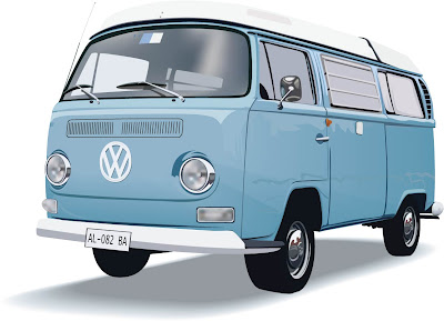
 My VW bus (again). I included this because it's my most detailed Illustrator example, and I spent a lot of time on it. I played around with the gradient meshes I had, lightened the windshield, fixed the shadows above the tires, and changed the front left tire so it's aligned with the rest of the vehicle. This way when I go on my imaginary seventies road trip I won't have to bring along a mechanic.
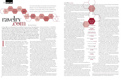
 This is my "indie poster" design, done in InDesign with an imported clipping path from Photoshop. My original clipping path had problems with the hair overlapping the top gradient box (there was some strange white space between the two), so I redid the clipping path. I also moved the top gradient box to the right so it aligns with the bottom black box, and I moved them both a little to the left to make them look like they're not supposed to bleed. The clipping path in this design is my most successful so far, at least now that its hair is fixed.
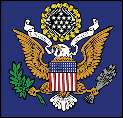
 This is my version of the U.S. Seal, traced over a rastor image. The original that I turned in didn't have the black background behind the image - I added it to make the eagle pop out from the blue background more, and to tie the different elements together. I also added a black border around the entire thing and tightened up some of my original paths. Then I drafted a letter to President Obama convincing him to let me redesign the seal entirely....eagles are SO passe.
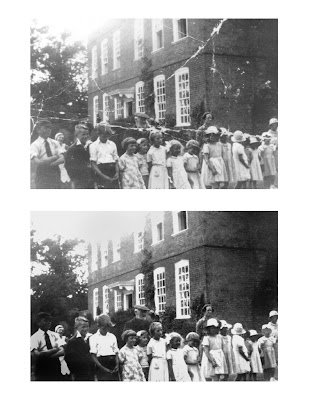
 This is a damaged photo I found online and retouched in Photoshop. I used the clone stamp tool to patch up the creases and scratches, then darkened the whole thing to make up for fading. I went in later and burned the lower corners, which had faded more than the rest of the photo, and I fixed a funky pattern in one boy's hair that I'd previously made with the clone stamp tool. I also removed some more faint scratches. I think it turned out pretty well, but I wish I'd had my own image to work with. Nevertheless, I got to play around with a lot of the tools in Photoshop and became a little more familiar with them.
No comments:
Post a Comment