Monday, May 4, 2009

The DSP Experience

I cannot believe that I came into this class not knowing how to use any of  the Adobe programs, and now I know all the basics. I wish I had had more time to work on my projects. I think DSP was even more deadline-crazy for me because I took so many art classes this semester, but the good news is that I am approximately five hundred times faster at getting things done than I was last semester. This was good for me, because I’ve built up all sorts of designing momentum that will hopefully last until I take Viscom I next spring.

I am excited for Viscom I because it’s more oriented toward the design aspect of graphic design, as opposed to the technical stuff. Obviously I needed to learn all of that (and there is still a lot I don’t know), but I chose visual communications as a major despite its use of computer programs, not because of it. Learning how to use InDesign and Photoshop and Illustrator is great, but I missed being pushed to design something that looks awesome, and as a result I think some of the work I did this semester is a little boring. So when I take Viscom I, I won’t enroll in three other studio classes, and I’ll design cooler stuff. At least that’s the plan.

Next year I will use the skills I learned in this class when I work on the design team for Detours Travel Magazine. I've already begun using Illustrator on my own - I designed a logo for a friend of my mom's, and I reworked the label of a Tabasco sauce bottle so it read "Lame Sauce" as a practical joke. Photoshop has been similarly helpful; I used it just last week to make a bitmap image to print on a T-shirt for printmaking class. Oh! I also used InDesign outside of class this semester to make a "lost sweatshirt" poster when I left my Truman hoodie in the dorm's laundry room - it's not that exciting, but I did get my sweatshirt back! So you can see I've definitely benefitted from DSP in more ways than one.


But anyway, here's my final portfolio. Enjoy!

Final Portfolio - Thumbnails

Although the thumbnails for the Chili Cook-Off poster aren’t colorful, they are my tightest thumbnail comps from this semester. I did quite a bit of work before I even began drawing the comps: brainstorming concepts, sketching a lot of pencil comps, and finally spacing them on two pages, penciling them in, and filling in with marker. They turned out rather nicely, I think, and I was the only one in my class to use a gray Prismacolor marker instead of all black.

I also think these thumbnails show great conceptual variety. Because the event was raising money for Heifer International (an organization devoted to promoting agriculture in developing countries), I thought of using an illustration of a corn plant with a ladle full of chili growing out of it. This turned out to be not as great a design choice as I had hoped, so I moved on to illustrations of chili peppers, bowls of chili, spoons, and cowboys (why not?) But the most significant reason for including these thumbnails in my final portfolio is the attention I paid to detail and to making them look snappy, the way I would have if I had been drawing them for a client.

Final Portfolio - Marker Comp

My best marker comp this semester was of the Marceline pamphlet. I should specify that my criteria for a marker comp does not overlap with my standards for a good design; while I think my Marceline pamphlet was a tad boring design-wise, the marker comp was very tight and looked very similar to the final product.  I also think that it was this assignment in which my Prismacolor marker skills finally began improving, and I got the hang of blending colors together to match those in the photographs.

            I knew that I had to be especially precise with this comp because of the copy fitting, but the precision extended further into the marker rendering of the photographs, such as the picture of the Marceline Hometown Museum. I think this picture is my most tightly rendered yet – certainly better than the very first marker comp assignment. I’m also happy with the map of Marceline because it’s an actual map of Marceline, but it’s much prettier than a screen shot of a Google Map.

But mainly I chose to include my Marceline Pamphlet in my final portfolio because it was a complicated project to begin with, due to the panels and copy fitting, and I am actually a bit surprised that it turned out as well as it did despite the challenges. And aside from the mediocre design, I would have no problem presenting it to a client.

Oh, you wanted a picture? Scroll down, please : )

Final Portfolio - Traditional Copy Fitting

My best example of traditional copy fitting is also the Marceline pamphlet. When compared to the final product, the text is very close in alignment and spacing. I have to say I was kind of amazed to do copy fitting the traditional way – who would have thought that graphic artists once had to be proficient in basic math? It was interesting to put my trust in numbers rather than being able to see everything all at once to place it on the page. I think this process hindered my design in a way (I mentioned before that I wish I had come up with a more original design), but I think that I could get used to it quickly and learn how to balance design with text.

 In any case, I had very little trouble fitting the text into the InDesign document exactly the way it was in my marker comp, and that’s the purpose of copy fitting. I’m not sure if I’ll use traditional copy fitting to this extent in any future designs simply because it can be done more easily with InDesign, but I can definitely see applying it in smaller doses, like for a title or a small block of text.


Final Portfolio - Best Design

My example of my best design is the Chili Cook-Off poster. I think that it stands out visually and grabs the viewer's attention. I used design principles like the rule of thirds and proportional hierarchy for the text. The black background box is there to provide contrast to the chili pepper and the text, and it gives some visual weight to the key word, "chili." I didn't get to choose which thumbnail I wanted to make into my final poster (I think I might have done a cowboy to be more original), but I think the pepper is bold and helps grab your attention. I chose this assignment as my best design because it's simple yet effective.

Final Portfolio - Typography

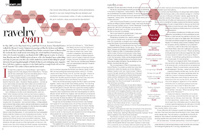
My best example of typography is the two-page magazine spread. This was a text-heavy assignment, so it was a typographical challenge, but I think it turned out well. I chose this as my typesetting example because the work I did on it was purely typography, since I recreated the layout and illustrations rather than designing them from scratch. I had to really work to make the text look exactly like it did in the magazine spread I chose, and I learned a lot of typography tricks for making things fit into certain spaces. Just from messing around with the text to make it look like my magazine article, I learned so many useful things: what the proper amount of kerning is in certain places, how to prevent hyphens at the ends of text lines, fixing widows and orphans, and using variations of the same font to make things cohesive. This assignment taught me the most about typesetting - what better way to learn than from professionals?

Final Portfolio - Creative Concept

I think my best creative concept was the one I had the most freedom with: my Favorite Ride promotion poster. I had a lot of fun designing it because I got to use my VW bus illustration. Since a VW camper is quite the nontraditional vehicle, I knew I had to come up with a wacky poster design. I brainstormed all the usual ideas for a car promotion poster, like a serious advertisement, but since my VW is a 1971 model, I eventually landed on the idea of a seventies-themed tour company. I thought of my target audience, who I imagine to be people a little older than my parents, who are adventurous and style-savvy and perhaps a little eccentric. They’d be looking for an all-inclusive trip, something strangely in between a resort and an RV. I’m not sure if anyone has ever tried to bridge that gap with an actual VW bus company, but if they have I would sure like to know about it.

Once I had my concept down, I began working on the visuals. I knew I wanted the poster to look modern and clean with seventies influences, so I decided early on to use orange in the background. Luckily my VW illustration was already a light blue color that I thought would pop out from the orange background, so I had my color scheme. I focused on the whimsical aspects of my concept, and instead of using a photograph or illustration of a trip, I used the camper as the focal point. I wanted to attract attention to the illustration, so my idea for an orangey background formed itself into a few swooshes that have the added benefit of leading the viewer’s eye around the poster.

I knew that since the color visuals in this poster were simple, I had to find a good seventies-inspired font for the text. This led to a few hours of distracted font-searching online (I think free font downloads are a new obsession of mine), and I found HuskyStash, which I thought was weighty enough and sufficiently retro.


Final Portfolio - Indesign

My example of proficiency in InDesign is my Marceline pamphlet. It is one of the most recent projects, so I had the most experience working with InDesign. Because I knew a little more about the program, my Marceline pamphlet is technically correct.

Final Portfolio - Illustrator

There have been a lot of Illustrator assignments this semester, but the one I spent the most time on is my VW bus illustration. I think it's technically correct and very detailed, which is what Illustrator is for. This assignment taught me the most about Illustrator and gave me the most practice drawing with curves, organizing layers, and using gradient meshes. I chose it as my example of proficiency in Illustrator because it was the single most challenging Illustrator assignment we had this semester.

Final Portfolio - Photoshop

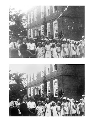
Photoshop is primarily an image editing program, and so I've kept that in mind by choosing my retouched photo as my example of proficiency in Photoshop. Although I've used Photoshop on nearly every project, to make clipping masks or change colors or convert modes, I still think my retouched photo exhibits the most Photoshop-specific skills. For this assignment, I used the clone stamp tool as well as the adjustment options like brightness and contrast. I also dodged and burned parts of the image, really working to get the best visual result from the original photograph.

Friday, April 24, 2009

All done!

Ok, never mind, it's printed now. I had no idea that I could just print from Preview and it would come out the right size. Whew!

Marceline Pamphlet

I finished my pamphlet!

But it's not printed. It's actually sitting in the print drawer right now, waiting to come to life so it can tell the story of its creation....which is not that exciting, really, but I'll tell it anyway.

First, I drew Steamboat Willie in Illustrator. This took about two hours. Then, I started on the map. The image I worked with was a Google map of Marceline, which is hardly fun to look at, so I decided to trace it in Illustrator. I don't know how long that part took, but it was way too long for the result I ended up with. And of course I had several pictures to tweak in Photoshop so they were all CMYK, 300 ppi, and the right proportions for my layout. Then came the text (11 point Baskerville font), and I didn't have too much trouble with it. Apparently my copyfitting was up to snuff, and I just needed to correct a few typos from the original copy. In any case, this was all done at about 10:00 last night. I won't go into the details of printing because they mostly make me look like an idiot, but I will say that I was in the lab until 10:50 and I still have no idea how to print a legal sized color document on the laser printer in the alpha lab. So there you go; el fin, y necesito pensar antes de trabajo.


Friday, April 17, 2009

Marceline Pamphlet Marker Comp

My marker comp for the Marceline brochure is a four panel, roll-fold, 8.5"x14" pamphlet. PamPHLET, excuse me. I am happy with the way I comped it - I think it's clean and the copy fitting is very tight - but I don't think my design is particularly original. There's too much white space, everything is square, and it's boring. I think I had a hard time thinking of the brochure as a whole, and I designed the panels individually. I guess the challenge with designing by hand is still remembering all the options a computer program gives you with regards to design. But (to focus on the bright side) my marker comp is pretty detailed, right down to the tiny hand-lettered street names on the map. I'm most happy with the rendering of the Walt Disney Hometown Museum, because it looks exactly like the photograph. Another note - I outlined Mickey with a thicker stroke around the edge, and it does make him pop out - voila! I was surprised. Anyway, here are the pictures, title side first:


Friday, April 10, 2009

Fishing Magazine Thumbnail

Here is the thumbnail of my fishing article layout. I like this one because it has a large picture and three columns of type on each page. I think I'll end up increasing the size of the title by quite a bit, and of course I'll have to make changes if it turns out that I've grossly overestimated the amount of text (which I suspect I might have done....bigger pictures, then?) Anyway, my marker drawings are not as tight as they should be in this thumbnail - the big picture is a stream bed, with rocks and water, if you can't tell from looking at it. The other two pictures are of people holding fish. In the small picture on the first page, a man is holding up a giant fish and giving a thumbs-up sign with a cheesy grin on his face. I think he's hilarious.

Wednesday, April 8, 2009

Final VW Poster

Here's what I printed out for my final poster. I rearranged the text, wrapping it around the van, and redrew the graphics to include a border. I'm still not entirely happy with the text layout, and I probably should have kept the bleed, but I think it's better than my marker comp overall.

Saturday, April 4, 2009

Half-sized VW Promotion Poster Comp

This is my marker comp of my VW camping trip ad. I couldn't scan all of it because I made it too big (I assumed that 50% meant area, not scale...oops). I like most of my design, but I'm not so happy with the text in a few places. I think in my final poster I'll move the heading so it doesn't overlap quite so much with the windshield, and I'll also fix the block of text so it's more square. I need to establish a grid before I do all of that, though, and hopefully the end result won't look too drastically different from the comp.


Wednesday, April 1, 2009

Thumbnaaaiiiiill!!!!!!

Just for kicks, here's my original thumbnail of the chili cook-off poster.

Final Chili Cook-Off poster

Here is my final chili cook-off poster, done in InDesign. I'm pretty happy with it - I think everything translated from marker comp to printing very well. I didn't change much at all; I did make the black box in the background align with both side margins, and I increased the stroke on the word "chili." And of course when I mounted the printed version on foam core, I forgot to leave a border. Go figure. Last night was a late night in the print shop, and I was a little preoccupied with getting the litho ink off my hands so it wouldn't smudge my poster. Anyway, I think if I had to change anything I would move "march 16th on the quad" to below the title and then somehow fix "in honor of national ag week" so it's not floating around on the top. I'd also add one or two more shades to the gray part of the pepper to give it some more depth (these were all suggestions from my professor...so not my own ideas, but I do happen to agree). 

Friday, March 27, 2009

Volkswagen Poster

My idea for a poster that incorporates my VW bus illustration is an advertisement for a 70's-themed tour company. Here are my ten thumbnails; Kristine helped me pick the fourth one and gave me some suggestions for modifying it, which I listed below.

The changes I plan on making (to the one with the blue VW and the two orange swooshes) include switching the text to say "camping expeditions" in a more seventies-ish font and also adding a yellow swoosh. Kristine liked the idea of combining this thumbnail and the one directly above it, so that the finished product has more color in the background and black text with a blue van to stand out against the orange.

Friday, March 20, 2009

Chili Cook-Off Poster Critique

This is one of someone's chili cook-off poster thumbnails. I chose it as my favorite out of fifteen because the concept is excellent; it's fun, unique, and would definitely appeal to college students (who doesn't like ninja chilis?). The overall layout of the illustration is diagonal, which is visually appealing, but the illustration seems a little small. I think the text and the illustration should fill up more of the negative space - probably by making one of the two bigger. I suggest enlarging the illustration so you can show every drop of sweat on those ninja chilis' brows. The main text, "chili cook-off," could also be a lot bigger to balance out the illustration and to make it fill the horizontal margins instead of looking so centered. The thumbnail doesn't really give an indication of what kind of font will be used, but I suggest something bold that can stand up to fighting chilis. Also, the layout doesn't have a lot of value contrast - perhaps a block of darker value in the background would be nice? Or a diagonal shape to accentuate the right chili's flying karate kick? Anyway, good concept overall.

Thursday, March 5, 2009

Midterm Portfolio

These are the five things I've spruced up for my midterm portfolio: two each from Photoshop and Illustrator and one from InDesign.


My VW bus (again). I included this because it's my most detailed Illustrator example, and I spent a lot of time on it. I played around with the gradient meshes I had, lightened the windshield, fixed the shadows above the tires, and changed the front left tire so it's aligned with the rest of the vehicle. This way when I go on my imaginary seventies road trip I won't have to bring along a mechanic.


This is my magazine layout (from Vogue Knitting). I've changed several things in this since I turned it in: I made the document into two facing pages instead of one tabloid page, fixed the alignment on the text, tried to copy exactly where specific words lined up on the page by adjusting the spacing, and made the margins closer to the original layout. I think I finally got it pretty close to the magazine. As a side note, the article is about Ravelry.com, an online knitting community, and it mentions several times that knitter have "abandoned their blogs" in favor of Ravelry. Ha. Seems I've done the opposite. 


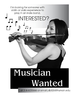
This is my "indie poster" design, done in InDesign with an imported clipping path from Photoshop. My original clipping path had problems with the hair overlapping the top gradient box (there was some strange white space between the two), so I redid the clipping path. I also moved the top gradient box to the right so it aligns with the bottom black box, and I moved them both a little to the left to make them look like they're not supposed to bleed. The clipping path in this design is my most successful so far, at least now that its hair is fixed.

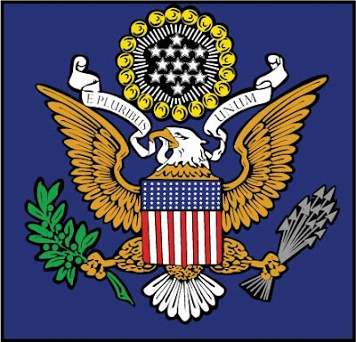
This is my version of the U.S. Seal, traced over a rastor image. The original that I turned in didn't have the black background behind the image - I added it to make the eagle pop out from the blue background more, and to tie the different elements together. I also added a black border around the entire thing and tightened up some of my original paths. Then I drafted a letter to President Obama convincing him to let me redesign the seal entirely....eagles are SO passe.
This is a damaged photo I found online and retouched in Photoshop. I used the clone stamp tool to patch up the creases and scratches, then darkened the whole thing to make up for fading. I went in later and burned the lower corners, which had faded more than the rest of the photo, and I fixed a funky pattern in one boy's hair that I'd previously made with the clone stamp tool. I also removed some more faint scratches. I think it turned out pretty well, but I wish I'd had my own image to work with. Nevertheless, I got to play around with a lot of the tools in Photoshop and became a little more familiar with them.

Tuesday, February 24, 2009


This is my illustration of a 1971 Volkswagen Westfalia camper (my parents used to own one...I think it was blue...)

Thursday, February 12, 2009

A blog! Jeez Louise!

This is my blog. I am a blogger.